Bedroom Wall Art: How to Choose the Right Print for Above the Bed
The wall above the bed is the most personal one in your home. Here's how to choose something worth waking up to.
Shop Prints →Most people treat the wall above the bed as an afterthought. Something goes there because something has to. It's actually the one wall in your home that's worth thinking about carefully, because unlike the living room or the hallway, you spend time with it every day at close range. You see it first thing in the morning. You see it last thing at night. What hangs there matters more than most people give it credit for.
This guide covers the practical side, size, orientation, hanging height, and the question most people skip over: what kind of subject actually works in a bedroom long-term, versus what just photographs well in a showroom.
What Actually Works Above the Bed
There's a specific thing that happens when you hang art above a bed and it's wrong. Not wrong in a technical sense, but tonally wrong. The room just feels slightly off and it takes a while to work out why. Usually it's because the image is too busy, too dramatic, or too obviously decorative. Something chosen to fill a space rather than to mean something.
The bedroom is a quieter room than the living room, and not because of any interior design rule. You're not entertaining guests in it. You're not showing it off. It's a room you actually live in, alone or with someone, and the art on the wall needs to sit comfortably in that context. Images with space in them tend to do that. A high alpine shot where the sky takes up half the frame. A still lake with nothing moving. Somewhere for the eye to land and stop.
Contrast that with a dramatic close-up, high-contrast wildlife shot, or anything with a lot of visual noise. Those prints can be excellent in a hallway or a study, places you pass through rather than settle into. Above a bed, they start to feel restless. Not always. But I've had enough customers message me after hanging something dramatic above the bed to know it's worth thinking about before you order.
The prints that tend to work best in bedrooms have a certain stillness to them. That's not a style rule, it's just what customers consistently tell me when they send photos of their rooms. The ones that land well are the ones where the image gives you somewhere to go rather than demanding your attention. If you're thinking about how seasonal subjects play in home décor generally, that stillness principle applies year-round in a bedroom, regardless of the season in the shot.

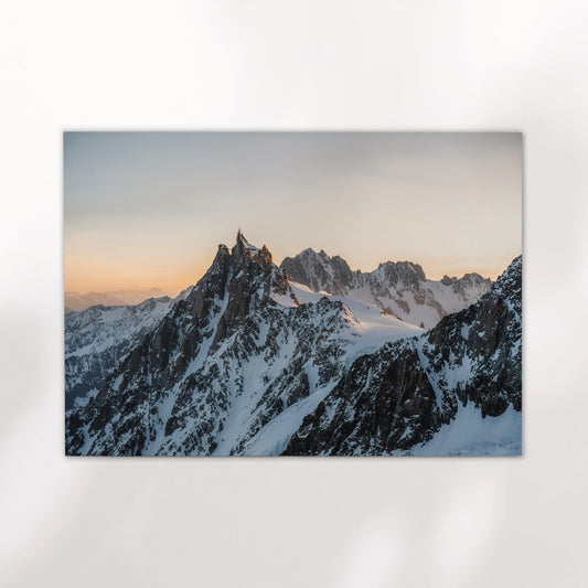
Alpspitze, Bavaria, Germany
Shot in the Wetterstein range above Garmisch-Partenkirchen, this is the Alpspitze at dusk. The pastel sky takes up most of the frame and the mountain sits cleanly against it. It's a quiet image despite the subject, which is exactly why it holds up well above a bed. Available in multiple sizes, unframed or framed.
View Print →
Size, Orientation and How High to Hang It
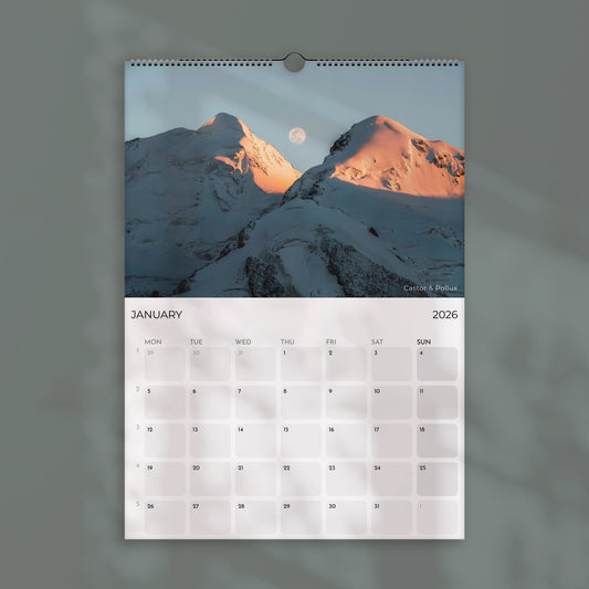
The most common mistake above a bed is going too small. A 30x40cm print above a double bed doesn't anchor the space, it floats in it. For most beds, the print needs to be wide enough to feel intentional. Two-thirds of the headboard width is a useful starting point. For a standard double, that puts you in the 60x80cm to 70x100cm range for a single print. For a king, you're looking at 80x120cm or wider, or a set of three panels that together read as one cohesive piece.
Orientation matters more above a bed than almost anywhere else. The headboard is a horizontal anchor and a landscape-format print sits naturally with it. Portrait prints can work if your ceilings are particularly tall, but on a standard ceiling height they tend to feel unbalanced, as if the image is trying to escape upward. When in doubt, go landscape.
One thing that changes the calculation is the headboard itself. A low, simple wooden headboard is neutral. A tall upholstered one is a visual element in its own right, and it competes. With an upholstered headboard, you need either a print wide enough to clearly dominate it or a triptych that wraps the whole space. A small single print above a large upholstered headboard will always look like an afterthought. If you're working with a feature wall concept generally, the advice in this guide on feature walls and large prints is worth reading alongside this one.
For a triptych, the Annestown Beach set below is a good example of how three panels work together horizontally. Each panel holds its own but the three together fill a wide wall without any single frame dominating. Space them about 5-8cm apart and hang all three at identical heights. It sounds obvious but a level and a measuring tape make a real difference here.


Choosing a Subject You Can Live With
This is the part most guides skip past. Size and placement are solvable problems. Subject matter is harder, because it's personal. But there are patterns. The prints I see most often in bedrooms, based on the room photos customers send, are landscapes with open skies, coastal scenes, and quiet wildlife shots. Not dramatic, not loud. Images with a certain calm to them that doesn't wear thin.
Wildlife works better in a bedroom than most people expect, but the type of wildlife matters. A red deer in early morning fog is a very different image to a charging animal or a dramatic predator shot. The Bavaria Deer print is a good example: soft autumn light, a stag half-hidden in the mist, earthy tones that sit quietly in a room rather than dominating it. It's the kind of image that rewards the longer look, which is exactly what you want in a room where you're going to be looking at it for years.
Colour or black and white is worth thinking about here too. Black and white landscape photography is more forgiving in a bedroom because it doesn't fight with the surrounding colours in the room. If your bedroom has warm tones, a cool-toned colour print can sit awkwardly. A monochrome coastal scene, like the Annestown triptych, sidesteps that entirely. That said, if the room is relatively neutral and you have a connection to a specific place, a colour print is worth it. The Ammersee boathouse shot works in a bedroom precisely because the palette is so restrained, gold, pale grey, quiet water. It doesn't shout.
The broader point is this: choose something you have a genuine feeling about. Not because it matches something, not because it fills the space, but because it means something. The print above a bed gets looked at more than almost any other artwork in a house. You might as well make it count. Browse the full collection if you want to see the range, but start with the places you know or the places you want to go. That's where the right print usually is.


Deer Wildlife, Bavarian Alps, Germany
Shot in the Bavarian Alps in morning light, this is the kind of wildlife image that works in a bedroom because it's still. No drama, no tension. Just a stag in the trees with the light coming in low. The earthy tones sit naturally in most bedroom palettes and the minimal composition gives the room space to breathe around it.
View Print →


The wall above the bed is the easiest one to leave blank and the hardest to get right. But when you do get it right, it's the most satisfying print in the house. Customers who send room photos almost always mention this one first.
Mark, Chamonix Prints
Find the Right Print for Your Bedroom
Landscape, coastal and wildlife photography, printed to order and shipped to your door. Multiple sizes, unframed or framed.
Browse Prints →