How to Frame and Hang
Your Art — Expert Tips
Frame sizes, groupings, placement heights, lighting, and protection — everything you need to display your prints exactly right.
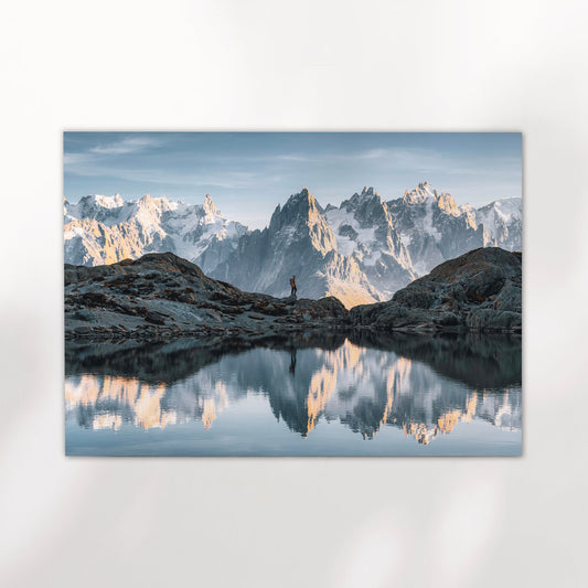
Browse the Collection →Few decisions shape a room as much as how you hang your art. A well-placed print transforms a blank wall into something that feels considered and personal. A poorly placed one — wrong height, wrong scale, wrong light — can make even a beautiful image feel like an afterthought. These tips cover the essentials, from choosing the right size to protecting what you hang.
"Hanging artwork doesn't have to be daunting. With thoughtful planning, you can transform your home into a curated space that's uniquely yours."
1. Choosing the Right Frame Size
The relationship between print size and wall space is the single most important factor in how art reads in a room. Too small, and it floats uncomfortably. Too large, and it overwhelms. Here's how to think about each size range.
Small Frames
Bathrooms, hallways, bedside tables, shelves.
Tip: Small frames look lost on large walls. Group them with other small pieces to create a cohesive arrangement — or simply place them on a shelf rather than hanging at all.
Placement: At eye level, or just above the feature it complements — a shelf, console, or bedside table.
Medium Frames
Kitchens, home offices, as part of a gallery wall.
Tip: Medium prints offer the most versatility — pair them with larger pieces or let them stand alone in smaller rooms.
Placement: Centre at eye level — approximately 145–150cm from the floor to the centre of the piece.
Large Frames
Living rooms, dining rooms, above a sofa or bed.
Tip: Large prints anchor a room. Avoid cluttering the space around them — let them breathe.
Placement: Leave at least 15–20cm between the bottom of the frame and the top of the furniture beneath it.

2. Curating Sets and Gallery Walls
🖼 Pairs of Two
Best for: Flanking mirrors, windows, or furniture for symmetry.
Tips: Use a consistent frame style or colour for cohesion. Align the top edges of both frames for a polished look.
Spacing: 5–8cm between frames feels balanced without looking too tight or too loose.
🖼🖼🖼 Groups of Three
Best for: Staircases, long walls, or above sectional sofas.
Tips: Arrange in a linear or triangular pattern. Varying frame sizes slightly adds visual interest without disorder.
Spacing: About 5–8cm between each piece for balance. The central piece should sit at eye level.

3. Highlight or Blend?
Before choosing where to hang a print, decide what role you want it to play — focal point or supporting element. Both approaches are valid; the mistake is being unclear about which you're going for.
Making Art a Focal Point
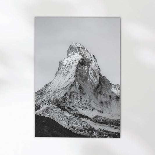
Choose: Bold colour, striking composition, or strong black-and-white contrast.
Light it: Use accent lighting to draw attention and separate it from the wall.
Place it: Where the eye naturally travels — above a mantel, at the end of a hallway, or centred on the largest unbroken wall in the room.
Give it space: Clear the surrounding wall. A statement piece loses its impact when surrounded by clutter.
Blending Art into the Room
Choose: Subtle, tonal pieces that echo or complement the room's colour palette.
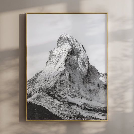
Frame it: Avoid overly ornate frames — a natural wood or simple profile frame integrates more quietly.
Place it: To complement existing furniture or architectural features without competing with them.
Consistency: Matching frame styles across multiple pieces helps the whole wall feel considered rather than assembled.
4. Lighting Your Artwork
Natural Light
Avoid direct sunlight on prints — UV exposure causes fading over time. Position art away from windows in direct sun, or use UV-protective glass or acrylic in the frame.
Accent Lighting
Picture lights, track lighting, or wall-mounted sconces work well for highlighting specific pieces. Aim the light at a 30-degree angle to minimise glare and avoid harsh shadows.
Ambient Room Light
Warm bulbs enhance the colours in warm-toned prints; cool light works better for black-and-white or blue-toned images. Match the tone of your lighting to the tone of the art.
5. Protecting Your Prints
6. Final Tips
- Measure twice, hang once. Use a tape measure and a spirit level. One slightly crooked print makes the whole wall look off — it's worth taking the extra two minutes.
- Test the layout with painter's tape. Before drilling, mark out each frame's dimensions on the wall with tape. Step back, live with it for a day, then commit.
- Balance the room, not just the wall. Consider the scale and proportion of the artwork relative to the furniture and the room as a whole — not just the available wall space.
- Hang at eye level. The standard rule is 145–150cm from the floor to the centre of the piece. Above furniture, measure 15–20cm from the top of the piece to the bottom of the frame.
- Stay true to your style. Art is personal. Rules are useful, but the most important one is that the piece means something to you. Start there and the rest follows.
Ready to Find Your Perfect Print?
Unframed giclée prints from €22,75. Sizes from 5×7" to A0. Standard sizes to fit any frame.
Browse the Collection →