Living Room Feature Wall Ideas: What Actually Works
Start with the room. Then choose the art.
Shop Prints →Most living room feature wall ideas focus on the art. What to hang, how big, what frame. But the art is usually the last decision that matters. The first one is placement — specifically, which wall you're actually looking at when you're in the room. Get that wrong and even a great print disappears.
This is a practical guide to making a feature wall work: which wall to choose, how to think about size, when a single large print beats a group of smaller ones, and when it doesn't. Most of what I know about this comes from photos customers send me of their prints on their walls. Not showrooms. Real living rooms with real furniture and real light.
Which Wall Actually Becomes the Feature
The biggest mistake people make with living room feature wall ideas is choosing the largest wall in the room. That's usually the one behind the sofa. It's not wrong, but it's not automatically right either. The wall behind your seating is the one your guests see. The wall you face when you sit down is the one you live with.
Those are different jobs. A print on the wall opposite your sofa becomes part of your daily view. You see it every time you sit down, every time you walk through the room. That's where atmosphere matters most. A print on the wall behind you is for other people. It shapes how the room reads when someone walks in, but you're never looking at it.
Neither is wrong. But I'd rather have the print I care about on the wall I actually look at. The wall you sit facing rewards something with depth and space — a landscape with sky in it, a mountain range with room for the eye to move. The wall behind the sofa can hold something more graphic, more immediate, because it's read quickly and from a distance. If you're thinking about how a single large print changes a room, that distinction is worth understanding before you buy anything.
One more thing on placement: the wall you see on entry to the room often has more impact than people expect. A print at the end of a sightline — something you catch as you walk in — sets the tone for the whole room faster than anything else. If your living room has a natural focal point on entry, that wall is often worth more attention than the one you defaulted to.t from the doorway, that's worth using.

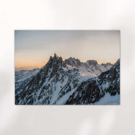
Aescher Guesthouse – Appenzell, Switzerland
This is a landscape print with real scale to it. The cliff face, the valley below, the sky above — there's a lot of space in the frame. It works on the wall you face, not the wall behind you. A 50x70cm or larger on a neutral wall is where this one earns its place.
View Print →
Single Print or Grouped Art: What Works When
The honest answer is that a single large print is harder to get wrong. Two or three smaller prints grouped together can look excellent, but it takes more decisions: spacing, alignment, whether the images actually sit well next to each other. Most gallery walls that don't work fail on one of those three things, not on the prints themselves.
A single print at 50x70cm or bigger reads as an artwork. The same image at 30x40cm on a large wall reads as a photograph — smaller than the wall, smaller than the furniture, smaller than you want it to feel. The wall art size guide covers the numbers in more detail, but the short version is: if you're unsure, go bigger than you think you need.
Where grouped prints do work well is when the images are genuinely related — same location, same palette, same mood. A pair of black and white alpine shots hung at the same height with consistent spacing will always look more considered than a mixed collection of different styles and subjects. The relationship between the images matters as much as the images themselves. A matched set removes most of the risk. Something like the Bionnassay and Grandes Jorasses set works precisely because the two images were shot in the same range, in the same light, and treated consistently in post — they belong together.
Portrait orientation also gets overlooked for living room walls. Most people default to landscape prints because that's what feels natural above a sofa, but a tall portrait print on a narrow wall between windows or beside a doorway can anchor a space that a landscape print would just float in. If the wall is taller than it is wide, work with that.


Colour vs Black and White for Living Room Walls
Black and white photography works in almost any living room. That's not a preference, it's just true. It doesn't compete with your furniture, your paint colour, your cushions. It sits quietly and lets the composition and the subject do the work. For a feature wall where you're not sure how the room will evolve — new sofa, repainted walls, different season — monochrome is the more forgiving choice.
Colour landscape prints are harder. A strong colour image can fight with everything around it if the tones don't align. But when it works — when the blue-grey of a mountain glacier sits against a warm neutral wall, or the earthy tones of an alpine meadow echo the furniture — it works better than any black and white print would. The key is that the dominant colours in the print need to either match or deliberately contrast with the room. Accidentally clashing is the only real failure mode.
The room temperature matters too. Warm rooms — wooden floors, amber lighting, earthy tones — tend to work better with prints that have warmth in them. Cool, white-walled rooms with grey furniture can handle more contrast, and black and white prints with real tonal range look excellent in them. That's not a rule, it's just a pattern worth knowing. There's more on this in the mountain wall art for living rooms guide if you want to go deeper on it.


"The prints that work best on a feature wall are the ones with space in them. Sky. Distance. Somewhere for the eye to go."
One last point that doesn't get said enough: the room changes the print, and the print changes the room. A large landscape in a busy room will look cluttered. The same print in a quieter room, on the right wall, with nothing competing around it, can shift the whole feeling of the space. Clearing the area around the print — taking down smaller things, simplifying the shelf nearby — is often the single most effective thing you can do before you hang anything.

Aiguille de Bionnassay – Chamonix, France (Black & White)
Portrait orientation, strong graphic contrast, minimal visual noise. This is the kind of print that works on a narrow wall, beside a window, or anywhere a landscape format would feel too wide. The monochrome treatment means it sits cleanly in rooms that already have a lot going on.
View Print →


The prints in the full collection range from the Swiss Alps to the Irish coast to the Dolomites. If the living room needs something with space and distance in it, that's a good place to start browsing.
Mark, Chamonix Prints
Find the Right Print for Your Wall
Every print is made to order, giclée quality, printed and shipped to your door. Multiple sizes from A4 to A0.
Browse Prints →