Black and White Mountain Wall Art: Why Monochrome Works in Any Home
Colour trends fade. A well-shot monochrome print of a real mountain rarely does. Here's why black and white works so consistently, and how to use it well.
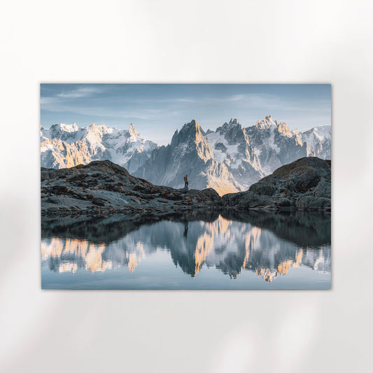
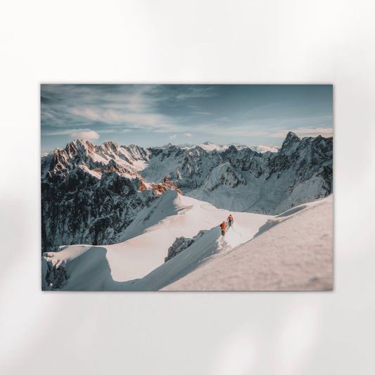
Shop Now →There's a reason black and white mountain wall art keeps appearing in living rooms, hallways, and studies across very different homes. It's not a style trend. It's more that removing colour from a landscape forces you to look at the thing itself — the shape of a ridge, the weight of cloud, the texture of snow. Our Aiguille du Midi monochrome print is a good example of what happens when you strip a mountain back to light and shadow alone. What's left is quietly striking. That quality tends to age well, whatever else changes in the room around it.
Why Monochrome Works So Well for Mountains
Mountains are built from contrasts. Bright snow against dark rock. Open sky pressing down on a sharp ridge. Mist filling a valley floor while the peaks sit clear above it. Colour can make those contrasts vivid, but black and white makes them structural. The image becomes about form rather than palette, and that tends to be a more settled, lasting thing to look at.
There's also a practical dimension. Colour photography ties a print to a specific light — the orange of a winter alpenglow, the blue cast of a clear high-altitude sky. Those colours can clash with a room's existing tones, or date quickly as interiors change. A monochrome print sidesteps all of that. It works next to warm timber, white walls, dark panelling, or exposed brick without needing to negotiate with the room's colour scheme.
That's not a compromise. It's a strength. The print doesn't compete with its surroundings — it anchors them. A well-composed black and white photograph of a mountain has a stillness that colour sometimes disrupts. It asks you to slow down and look, rather than react to something visually loud.
For mountain photography specifically, monochrome also has a history. Some of the most enduring Alpine images ever made were shot in black and white, long before colour film was practical in the field. There's a visual language to it that feels right for these landscapes, even now.

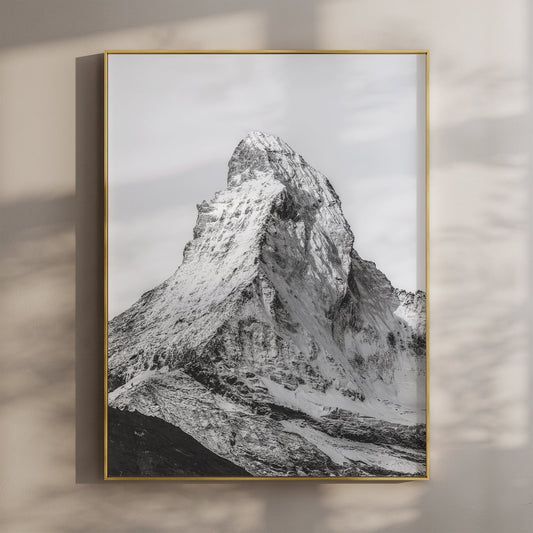
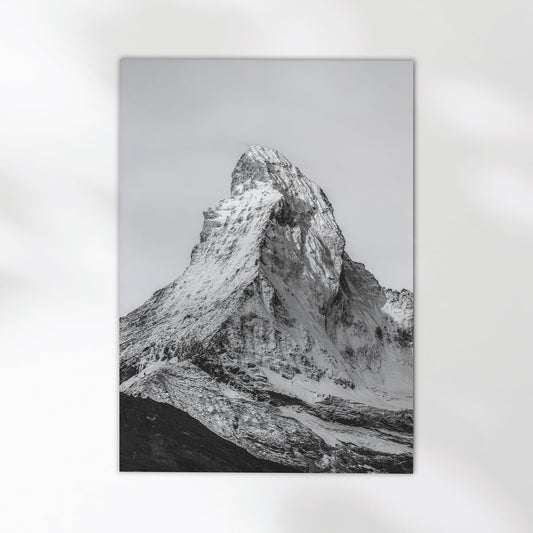
Aiguille de Bionnassay – Chamonix, France
Shot on the Mont Blanc massif, this portrait-format print captures the Bionnassay needle in stark monochrome. High contrast, clean composition. It works on its own or as part of a larger wall arrangement.
View Print →Which Rooms Suit Black and White Mountain Prints
The short answer is most of them, but not for the same reasons. In a living room, a large monochrome mountain print does what colour art can sometimes struggle to do: it adds presence without dominating. The eye goes to it, sits with it, and moves on. It doesn't demand attention every time you walk past. For more on sizing and placement in that context, the guide on mountain wall art for living rooms covers the practical detail well.
In hallways and entryways, black and white works because these tend to be transitional spaces with mixed lighting. A colour print can look washed out or inconsistent under artificial light; a monochrome print holds up better because tonal contrast is doing the work, not hue. A portrait-format print like the Aiguille de Bionnassay fits well in narrow vertical spaces for exactly this reason.
Bedrooms and studies are where people most often reach for something calm and considered. Monochrome mountain photography tends to land well here because it's not busy. There's a lot of sky, a lot of negative space. The image gives you something to look at without wiring you up. That's useful in a room where you want to think or wind down.
"Removing colour from a mountain photograph doesn't simplify it. It makes you look more carefully at what's actually there."
Kitchens and dining rooms are less obvious but still worth considering, particularly for smaller prints. A monochrome print in a kitchen with natural timber cabinets or white metro tiles tends to feel considered rather than accidental. It's the kind of thing people notice without necessarily knowing why the room feels put together.


Choosing the Right Print for Your Space
The main thing to get right before anything else is scale. A print that's too small for a wall disappears. One that's too large can make a room feel compressed. As a rough guide: a sofa wall in a standard living room suits something in the A1 to A0 range, a hallway works better with A2 or A3 in portrait orientation, and a study or bedroom desk wall is usually fine with A2. Most prints are available across several sizes, so it's worth thinking about the wall before you choose.
After scale, think about tonal weight. Some of the monochrome mountain prints in this collection sit toward the darker end — deep shadows, heavy cloud, rock faces with very little highlight. Others are lighter and more open: a lot of white sky, pale snow, thin air. Neither is better, but they feel different on a wall. A darker, more contrasty print makes a stronger statement; a lighter, airier one sits more quietly. The Aiguille du Midi in clouds print leans toward the latter — the mountain emerges from mist rather than sitting hard against a clear sky, and there's a softness to it that works well in rooms that need something calm rather than dramatic.
Framing matters too, though it's often overlooked until the print arrives. For black and white photography, a thin black or natural oak frame tends to work well. White frames can feel clinical. Wide mounts in off-white or light grey add breathing room and lift the print away from the wall in a way that feels considered. If you're unsure, simple and narrow is rarely wrong.
Aiguille du Midi Triptych – Chamonix, France
Three panels, one mountain. This black and white triptych of the Aiguille du Midi is built for a wide wall — a chimney breast, a hallway end, or a long living room feature wall. Shot in snow, with serious negative space in the sky panels.
View Print →Single Print or a Set: How to Decide
A single strong print is easier to place and rarely goes wrong. Most walls, most rooms — one well-chosen image, properly sized, does the job. The Aiguille de Bionnassay portrait print is a good example: it's a complete image that works on its own without needing anything around it.
Sets and triptychs are a different proposition. They suit larger walls where a single print would either need to be enormous or risk looking a bit lost. The Bionnassay and Grandes Jorasses set of two pairs well because both images share the same tonal register and subject matter — they clearly belong together without being identical. If you're building a gallery wall, starting with a matched set in monochrome and adding to it gradually is a more reliable approach than trying to mix and match from the start. There's a full practical guide to spacing and hanging a triptych in the post on how to space a triptych on a wall, which is worth reading before you commit to drilling anything.
For gifts, a set often feels more generous than a single print without being more expensive. Two prints that clearly go together give the recipient something to work with rather than just one decision to make. Browse the full collection to see what's available as matched sets and individual prints.
Minimal & Modern
White walls, clean lines, not much else on the wall. A single large-format monochrome print of a sharp Alpine peak works well here. Go for high contrast — dark rock, pale sky — and keep the frame thin and simple. The image does all the work.
Warm & Textured
Timber floors, linen sofas, natural materials. A softer monochrome print — more grey mid-tones, less hard contrast — fits better here than something very stark. The Aiguille du Midi in clouds has that quality. Pair with a natural oak or walnut frame.
Gallery Wall
Mixing prints across a larger wall. Black and white is the simplest way to make a gallery wall feel cohesive — different compositions and sizes, but the same tonal palette holds everything together. A matched set like Bionnassay and Jorasses gives you a solid starting point.
Find Your Print
All prints are available in multiple sizes, printed to order on museum-quality paper and shipped to your door. Black and white or colour, single prints or sets — browse the full collection to find what fits your wall.
Browse Prints →