Feature Wall Ideas: How a Single Large Print Changes a Room
One well-chosen print. No gallery wall needed. Here's how to make it work.
Shop Now →When people search for feature wall ideas, they're usually imagining something complicated — painted accent walls, expensive wallpaper, rows of frames. But one of the most effective things you can do with a bare wall is hang a single large print and leave it alone. The right image at the right scale doesn't compete with the room. It anchors it. This guide walks through how to choose the print, find the right size, and place it well — with some real examples from the full print collection to help you picture it in your own space.
Why One Large Print Often Beats a Gallery Wall
Gallery walls are everywhere right now, and they work well in the right space. But they take time, they require a certain tolerance for organised chaos, and when they're off — even slightly — they pull attention for the wrong reasons. A single large print is a different proposition entirely. It's calm. It's confident. It makes a decision and sticks to it.
There's also something about scale that changes how a room feels. A small print on a big wall disappears. A large print on the same wall becomes part of the architecture. The room starts to feel designed rather than decorated. That distinction matters, especially in open-plan spaces or rooms with high ceilings where smaller pieces get lost entirely.
Landscape photography works particularly well in this format because the images are built for width. A wide mountain ridge, a stretch of coastline, a valley in low cloud — these are horizontal compositions that reward size. When you see them large, you get the sense of space that the photographer was standing in. When they're small, you lose it.
The other advantage of going with a single piece is that it's easier to live with. You choose once, carefully, and then you stop thinking about it. It becomes part of the room rather than something you're still adjusting six months later. That's worth something.
If you're weighing up whether to go large with one print or try a multi-panel arrangement instead, our guide on how to space a triptych on a wall covers the alternative approach in detail — it's worth reading both before you decide.

Aescher Guesthouse – Appenzell, Switzerland
The Berggasthaus Aescher sits on a ledge in the Alpstein, wedged between cliff and sky. It's a landscape that rewards a large format — all that vertical drama reads completely differently when the image has room to breathe. A strong choice for a living room or hallway feature wall.
View Print →
Choosing the Right Image for Your Feature Wall
The image matters more than the frame, more than the size, and more than the wall colour behind it. Everything else is adjustable. The image is what you'll be looking at every day, so it has to mean something to you personally. That's not a soft point — it's a practical one. Prints that have a connection to somewhere you've been or somewhere you want to go last in a room. Purely decorative pieces don't.
For feature walls specifically, you want an image with a strong horizon or a clear focal point. Busy, detailed images can feel restless at large scale. An image with space in it — sky, sea, distance — gives the room the same quality. That's the thing landscape photography does well that almost nothing else does: it brings a sense of open air into an interior.
"The image has to mean something to you. Prints that connect to somewhere real last in a room. Purely decorative pieces don't."
Colour temperature is worth thinking about too. Cool-toned images — blue-grey mountains, overcast coastal shots, winter light — tend to work well in modern or minimal interiors. Warmer tones, golden hour light on rock, autumn hillsides, sit more naturally in spaces with wood, linen, or earth tones. Neither is better. It depends entirely on the room you're putting it in.
If you're unsure about colour, black and white mountain wall art is worth considering — monochrome prints are genuinely versatile and almost always work against any wall colour, which removes one variable from the decision entirely.


Sizing and Placement: Getting It Right First Time
Size is the decision most people get wrong, and they almost always go too small. A print that looks large in an online preview can feel underwhelming on a real wall. As a general rule, your print should cover roughly two-thirds of the wall width it's hanging on. For a sofa wall, that typically means something in the A1 or A0 range. For a narrower hallway wall or above a bed, A1 often works well. A4 and A3 prints are better suited to shelves, desks, or grouped arrangements — on their own on a large wall, they tend to read as afterthoughts.
Hanging height matters as much as size. The centre of the print should sit at roughly eye level — around 145 to 150cm from the floor. When a print hangs too high, the room feels disconnected. When it's too low, it looks awkward above furniture. The one exception is above a sofa or bed, where you want the bottom edge of the print to sit about 20 to 25cm above the furniture itself.
For portrait-format images, narrower walls — the strip of wall between two doors, for example, or the wall at the end of a hallway — are ideal. The vertical format fills the space naturally without spreading too wide. For wide landscape shots, broad walls with little interruption give the image the room it needs. The Aiguille d'Entrèves landscape print is a good example of an image that rewards horizontal space — the ridge line and sky have a natural breadth that only reads properly at A1 or larger.
One last thing on sizing: print sizes at Chamonix Prints run from A4 up to A0. Every print is made to order, so you're not constrained by what's in stock. If you're ordering something large and you're not sure which size to go for, go one size up from your instinct. You'll almost certainly be glad you did.


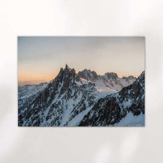
Aiguille d'Entrèves – Chamonix (Portrait)
The portrait format of the Aiguille d'Entrèves works well on a tall, narrow wall — a hallway, the wall beside a staircase, or a bedroom alcove. The Mont Blanc Massif in winter. It's a simple image, and that's what makes it work at scale.
View Print →Room by Room: What Works Where
Different rooms call for different approaches, even when the principle — one large print, well placed — stays the same. In a living room, the sofa wall is the obvious choice and it usually works well. The key is that the print should relate to the sofa below it in width. A print that's narrower than the sofa looks out of balance. At A0 or A1, a wide landscape image typically sits well above a two or three-seat sofa. Wide shots with open skies — coastlines, mountain valleys — tend to work better here than very tight or intense compositions.
In a bedroom, the wall above the bed is a natural feature wall, and prints here tend to feel more personal. Something that connects to a place you've actually been carries a different quality in a bedroom than a more decorative piece would. It's the last thing you see at night. That's worth thinking about when you choose the image. Cooler tones and quieter compositions tend to feel more settled in this context than high-contrast drama. If you're interested in how landscape prints specifically work in this setting, our guide on New Zealand wall art is a good reference point for the kind of wide, calm landscape images that sit well in a bedroom.
Hallways are underrated. Because you move through them rather than sitting in them, the impression is quick — but that's exactly why a strong image works so well there. A portrait-format print on the wall at the end of a corridor stops the eye and gives the space a destination. It turns a functional corridor into something worth looking at.
In an open-plan kitchen and dining space, the wall behind a dining table is often the most visible surface in the room and the one most people leave blank longest. A large landscape print here pulls the room together and gives it the sense of being designed from the start. Warm-toned images tend to work better in kitchen spaces — something with golden light or earthy tones sits more naturally alongside wood and natural materials than a cold, blue-grey winter shot would.
Living Room
Wide landscape format, A1 or A0. Centre the print above the sofa, matching the sofa's width as closely as you can. Open compositions with sky or distance work best. Avoid very tight or busy images at this scale.
Bedroom
Above the bed, portrait or landscape both work. Choose something with personal meaning — a place you've been or want to go. Quieter tones settle better here. A1 is usually the right size for a standard double bed wall.
Hallway
End walls and narrow side walls are perfect for portrait-format prints. A hallway is a brief experience — one bold image is enough. Don't over-style it. One print, well placed, does everything it needs to.


Find the Print for Your Wall
Every print is made to order, from A4 to A0, printed on museum-quality matte paper and shipped to your door. Browse the full collection and find something worth hanging.
Browse Prints →