Not all landscape paintings of Switzerland belong on the same wall, and treating them as interchangeable is where most prints go wrong.
Swiss landscape photography splits into three distinct moods: the pyramid drama of a peak like the Matterhorn, the deep, quiet scale of a glacial valley, and the pastoral calm of alpine pasture. Each one asks something different of the room it hangs in. Confuse them and you get a print that never quite settles.
Peaks Pull, Valleys Rest
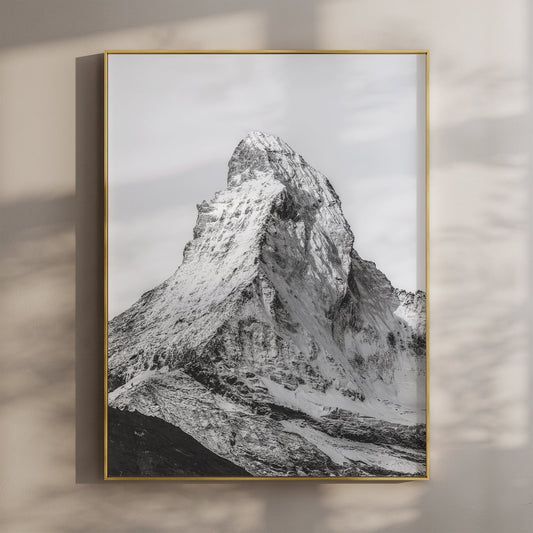
A Matterhorn print pulls the eye up and out. That pyramid shape is doing something to the room the moment it's on the wall: it introduces vertical energy, and it wants a wall that isn't already busy. A landing, a stairwell, a study with a plain wall opposite the door. Rooms that already have a lot going on, patterned rugs, dark cabinetry, a gallery wall of family photos, will fight it.
A Lauterbrunnen valley print works in the opposite direction. Sheer cliffs on both sides of a valley floor, the Staubbach Falls dropping from the plateau above, and a village sitting quietly at the bottom of it all. There's somewhere for the eye to land and stay, rather than being pulled skyward. That makes it a better fit for a living room or bedroom, somewhere you want to look at something without it demanding attention every time you pass.
The mistake people make is buying the most dramatic image in the collection because it photographed well, then hanging it somewhere that needed something calmer. The landscape decides the room, not the other way round.

Colour Landscapes of Switzerland vs Black and White
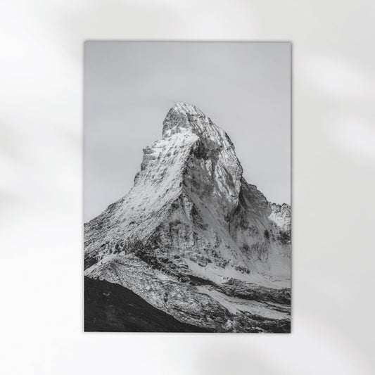
Black and white mountain photographs work in almost any room because they step back from competing with your furnishings. Strip the colour out of a peak and you're left with contrast, shadow and form, which sits quietly next to whatever else is on your walls or floors. The black and white Matterhorn print is the print I'd point most people toward if they're not sure their walls, rug and sofa are all going to agree with each other.
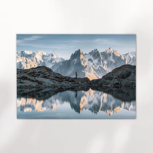
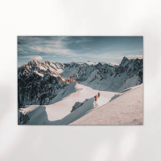
Colour Alpine landscapes are harder. They fight with everything around them: warm evening light on rock, the specific blue of a glacial sky, greens in a valley floor. If you're drawn to a Swiss landscape in colour, the room needs space and restraint to make it work. Plain walls, neutral furniture, nothing else nearby competing for attention. It's not that colour is wrong, it's that it demands more from the room than monochrome does.

Matterhorn – Zermatt, Switzerland (black & white)
Shot in Zermatt in minimalist conditions, this version of the Matterhorn keeps the ridge and rock face but drops the colour, which is what lets it sit in a room a colour print couldn't. Giclée printed on 200gsm premium matte fine art paper.
View Product →Some people simply want the mountain in colour, the way they saw it. Fair. But if the goal is a print that lands rather than one that has to be defended against the rest of the room, monochrome is the lower-risk choice. It's worth being honest about that trade-off before buying.
Match the landscape to the room, not the room to the landscape.
A dramatic peak needs a plain wall and some breathing room. A valley print works almost anywhere calm is wanted. If your room is busy or you're unsure, go black and white. Colour Alpine prints reward restraint, they don't forgive clutter.
Landscape Photography of Switzerland Beyond the Peaks
Switzerland isn't only mountains. The Appenzell cows print, shot in the summer pastures below the Alpstein peaks, is a pastoral scene rather than a mountain one, and it belongs in different rooms entirely: kitchens, farmhouse interiors, hallways where a dramatic peak would feel out of place. It's the print for someone who wants Switzerland without the ski-resort cliché, warm light on a working landscape rather than a postcard summit.


If you're buying for someone who's been to Switzerland, a generic mountain image reads as stock photography. A specific place, Zermatt, the Bernese Oberland, Appenzell, reads as somewhere they've stood. That specificity is the difference between a print that lands and one that doesn't.
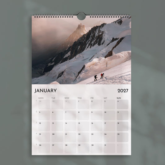
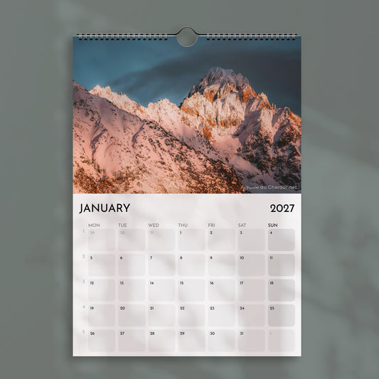
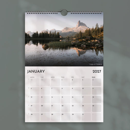
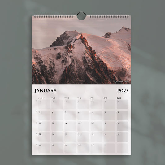
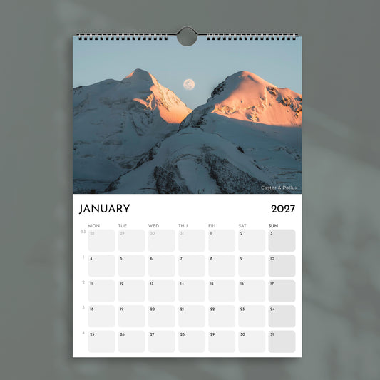
For gift buying, the Switzerland 2027 Wall Calendar covers more ground than a single print can: 12 months on 7 sheets, one full-page image per month, from the Matterhorn at sunset to wide valleys under snow. It's printed on 250gsm premium semi-gloss silk paper and comes in A4 or A3 for Europe, or Letter and Ledger sizes for the US and Canada. It's a lower-commitment way to live with the range of Swiss landscape before settling on one to frame.
Browse the full collection if you want to see how the peaks, valleys and pastures sit next to each other before deciding.


What is the best landscape photography style for Switzerland? ⌄
Should I choose a colour or black and white Swiss mountain print? ⌄
Is Swiss landscape photography only for chalets and ski lodges? ⌄
What size Matterhorn print works best above a sofa? ⌄
How long does delivery take for a Swiss landscape print? ⌄
Find the Swiss landscape that fits your wall, not just your memory
Peaks, valleys and pastures each ask something different of a room. Browse the full range and pick the one that actually belongs in yours.
Browse the Collection →