Wall Art Size Guide: How to Choose the Right Print for Every Room
Most people go too small. Here is how to get the size right before the print arrives.
Browse Prints →Most people go too small. Not slightly too small, noticeably too small. A print that looked substantial on screen arrives and sits on the wall like a notice pinned to a board. The wall is not the problem. The size is. This guide is about getting that decision right before you order.
Why Going Too Small Goes Wrong
A print hung on its own needs to be larger than most people expect. The eye does not compare it to the sideboard below. It compares it to the wall behind it, and walls are big. A 30x40cm print on a 2.5m wall reads as a small object hung on a large surface. It does not read as artwork. The same print in a narrow hallway or on a small chimney breast can look exactly right. Context changes everything.
The other thing that catches people out is the difference between how a print looks on screen and how it looks on a wall. Product images are photographed to make the print look good, not to give you an accurate sense of scale. A 50x70cm print looks substantial on a monitor. On a wall, especially a large one, it can feel modest. The fix is low-tech. Cut a piece of paper or card to the exact dimensions of the size you are considering. Hold it against the wall where you plan to hang it. Step back. If it looks small in that test, order the next size up.
Ceiling height changes the equation for portrait-format prints. A tall narrow print in a room with a low ceiling can feel like it is trying to escape through the top of the wall. Landscape formats are more forgiving, which is one reason a 50x70cm horizontal print tends to work in more rooms than a 50x70cm vertical one. Same area on paper, different feeling on the wall.
One more thing that often gets overlooked: what else is on the wall. A print hanging next to a window, a mirror, or other artwork is not read in isolation. It is read as part of a group. In that situation, a slightly smaller print can work well because it is carrying less visual weight on its own. An empty wall with nothing else near it demands more from a single print. That is when size becomes critical.

Aescher Guesthouse – Appenzell, Switzerland
The Berggasthaus Aescher sits on a cliff ledge in the Alpstein. The composition is wide and open, with plenty of sky above the ridge. That kind of horizontal space is exactly what works well above a sofa or sideboard, where you want the eye to settle rather than move.
View Print →
Sizing for Furniture and Wall Width
The relationship between a print and the furniture below it is where most sizing decisions get made, and where most mistakes happen. The general principle is that a print should be narrower than the piece of furniture it sits above. But how much narrower depends on the size of the wall behind it. A 50x70cm print feels right above a sofa, but only if the sofa is under about 1.8m wide. Go wider than that, and the print starts to look small even if it is technically within proportion to the furniture. At that width, you either need to size up to 70x100cm or go to a pair of prints hung side by side.
Above a bed is a slightly different calculation. The headboard width is the reference point, not the bed width. Most double headboards run between 1.4m and 1.6m wide. A 50x70cm print in landscape format sits comfortably in that space. A portrait format print at the same size can work too, though it tends to look better when hung slightly lower, closer to the headboard, rather than centred on the wall. If you are working with a king or super-king headboard, or a wide panelled bed, consider 70x100cm. A print that is clearly smaller than the headboard below it looks hesitant.
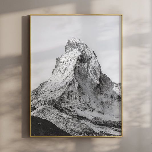
Hallways and narrow spaces have their own logic. The wall is usually shallow in depth and the viewer is close. In that situation, a single print at 40x50cm or 50x70cm can feel generous rather than small. A large print in a narrow hall can feel like it is coming at you. The prints that work best in those spaces tend to have simplicity in them. A single ridge line. A wide sky. Something the eye can take in from close range without feeling crowded. The Aiguille de Bionnassay in black and white is a good example of that kind of composition, a portrait format with clean lines that reads well in a tighter space.
For a dining room or kitchen, scale back slightly from what you would hang in a living room. People sit closer to the walls in those rooms. A 50x70cm print at eye level above a sideboard or console works well. What tends to fail is a very large print in a small dining room, the image ends up dominating the space rather than sitting in it. Browse the full collection to get a sense of which compositions suit different formats.


When a Pair Works Better Than One
There is a point at which a single print stops being the right answer. It is usually when the wall is wide, the furniture below it is long, or both. A sofa over 1.8m wide with a single 50x70cm print above it is one of the most common sizing mismatches in home decorating. The print is not wrong in itself. It is just outnumbered by the wall around it. Two prints at the same size, hung as a pair with a consistent gap between them, fill the space without requiring you to jump to a format that might be too large for the room.
A pair of prints also gives you more flexibility with orientation. Two landscape prints side by side work well above a wide sofa or low credenza. Two portrait prints as a pair work in a taller wall space, particularly in a stairwell or landing. The key is keeping them consistent. Same size, same frame if you are framing them, similar tonal range. A pair of black and white prints tends to be the most forgiving in this respect because the palette is already resolved. You are not trying to match colours or manage contrast between two different images. For guidance on hanging multiple prints with good spacing, the post on how to space a triptych on a wall covers the principles that apply to pairs too.
Sets are not just a workaround for large walls. Sometimes two images together say something a single image cannot. The relationship between them matters. Two prints from the same mountain range, shot in similar light, read as a considered choice. Two unrelated images in mismatched styles read as indecision. If you are buying a set, look for prints that share something, a palette, a subject, a mood, without being identical. Identical is dull. Considered is the aim.


Aiguille de Bionnassay and Grandes Jorasses – Set of 2 (Black and White)
Two portraits from the Mont Blanc massif, shot in black and white. The tonal range matches closely enough that they hang as a pair without needing to be framed identically. A practical solution for a wide wall where a single print would not carry the space. Delivered in 5–7 business days.
View Print Set →


Find the Right Print for Your Wall
Real places, real photographs. Sized to work on real walls.
Browse the Collection →