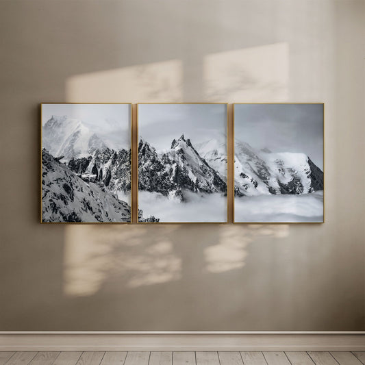
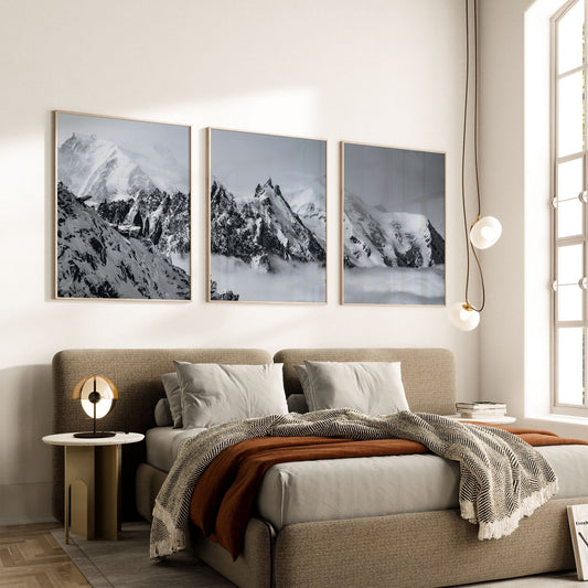
Black and white landscape prints aren't neutral because they're muted. They're neutral because they've been stripped down to geometry and light, and geometry doesn't clash with anything.
A colour photograph of a mountain or a coastline has to negotiate with your sofa, your carpet, your curtains. A black and white one doesn't. That single fact is the whole case for neutral wall art living room shoppers keep circling back to, and it's why so many people who love mountains and coastlines end up hanging something else instead. They assume landscape means decorative, and decorative means it'll date.
It doesn't have to. When you remove colour, the tonal relationships between what's close, what's distant, and what's open sky become the whole visual grammar. That's what lets a black and white print sit on a wall next to contemporary furniture without competing for attention.
Why Monochrome Reads as Neutral Wall Art
In a colour photograph, a lot of the visual weight comes from hue: the green of a hillside, the blue of a lake, the gold of low sun. Take colour away and that weight has to go somewhere else. It goes into tone and shape. Misty forest, reflected light on water, the gradation of a winter sky: all of it becomes structural rather than decorative texture.
That's the mechanism behind why a print like the Deer Wildlife – Bavarian Alps, Germany print reads as considered rather than rustic. Shot from behind, the stag's antlers become a clean silhouette against pale light. There's no colour telling you "countryside." There's just a shape against a ground, and shapes against grounds work in any room.
This is also why the same print can hang beside patterned cushions, exposed brick, or a pale oak floor without looking like it wandered in from a different house. Nothing in it is competing for the same visual register as your furniture. It's operating on tone and form, and your furnishings are operating on colour and texture, so they never actually collide.

Landscape Art That Grounds a Room Instead of Decorating It
The mistake people make is treating "landscape" and "modern" as opposites. They're not, if the print stays anchored in what was actually observed rather than reaching for atmosphere. A scene shot at a specific time, in specific light, on a specific coastline, has none of the dated style signals that make landscape art feel like it belongs in a hallway you're trying to forget.
The Annestown Beach – Ireland set of three makes this case well. It's Annestown Beach on the Copper Coast of County Waterford, shot in monochrome, where sea-smoothed pebbles give way to Atlantic swells and the cliffs fold into the water. Split across three panels, it reads less like a picture of a beach and more like a study in horizon lines. If you're weighing whether a triptych or a single large print suits your wall, our piece on how a triptych changes a room goes into the spacing and scale decisions in more depth.
What Makes a Landscape Print Genuinely Neutral
Not every black and white photograph earns the word neutral. A few things separate the ones that do from the ones that just look moody:
- A clear tonal range, from near-black to near-white, rather than a flat grey wash
- A strong compositional line: a horizon, a ridge, a silhouette, something the eye can follow
- A subject specific enough to feel observed, not generic enough to feel like stock photography

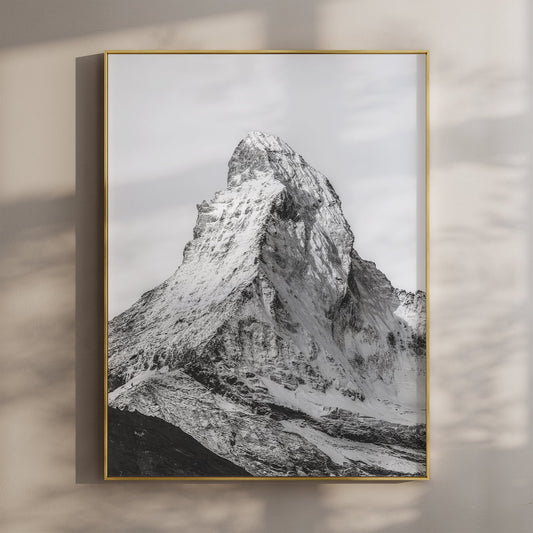
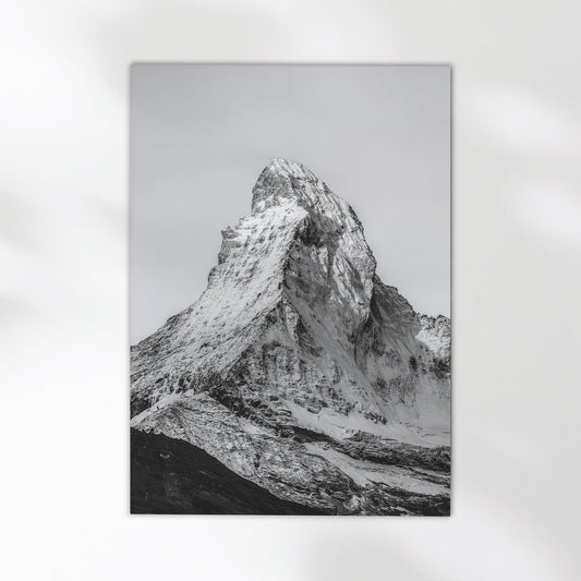
Alpspitze, Bavaria, Germany
Shot from the lower alpine slopes near Garmisch-Partenkirchen, this print catches the Alpspitze at day's edge, one of Germany's more recognisable summits rising sharply above the Wetterstein forest. The composition is built on the same foreground-to-sky logic that makes monochrome landscapes sit easily against modern furniture: the peak does the talking, nothing else competes. High-quality giclée print on 200gsm premium matte fine art paper.
View Product →The strongest objection to all this is fair: a black and white mountain print is still, undeniably, a picture of a mountain. If you actively dislike landscape photography as a genre, stripping the colour out won't change your mind. But that's a different problem from the one most people bring to a modern living room. Most aren't rejecting landscapes on principle. They're worried a landscape print will look twee, dated, or too literal next to a plywood shelf and a low sofa. Monochrome answers that specific worry, because it removes the exact quality, colour saturation reading as "decorative", that makes a print feel like a country pub print rather than a considered piece.
Choose the black and white version when in doubt
If you're torn between a colour landscape and its monochrome equivalent for a modern room, take the monochrome one. It gives you the same subject with none of the negotiation a coloured print demands from your existing palette.


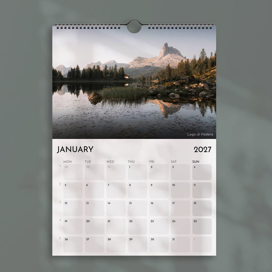
The Ammersee print above is shot in colour, at golden hour, where low sun turns the lake gold through the boathouse stilts. A muted, tonally consistent palette, warm gold against still water, browns and greys, can sit as quietly as monochrome, provided your room isn't already carrying strong colour elsewhere. Black and white removes the negotiation entirely.
Sizing is its own decision once you've settled on the image. A single portrait print reads differently at A3 than at A0, and a lot of that judgment depends on wall height and what's already on it. Our wall art size guide and the room-by-room breakdown both work through this in more detail than makes sense here. All Chamonix Prints work is printed unframed, from 5x7 inches up to A0, on 200gsm premium matte fine art paper, so the size decision is genuinely open rather than fixed by stock. You can browse the full range in the collection if you want to compare formats side by side.


Is black and white wall art too plain for a living room? ⌄
Does neutral wall art mean beige or grey only? ⌄
What size neutral print works best above a sofa? ⌄
Can I mix a black and white landscape print with patterned cushions? ⌄
Are unframed prints suitable for a modern living room? ⌄
Landscape that grounds a room, not decorates it
Every print in the collection is unframed, printed on 200gsm premium matte fine art paper, and shipped in 5-7 business days.
Browse the Collection →