Autumn Home Décor Wall Art: How to Choose Prints That Actually Work
The right warm-toned landscape print can pull a room together. The wrong one just sits there. Here's how to tell the difference before you hang anything.
Shop Now →Autumn home décor wall art is one of those things that sounds simple until you're standing in a room that isn't responding the way you hoped. The print is warm, the tones looked right on screen, and in the room it's either gone flat against the wall or it's pulling against every other colour in the space. The issue is almost never the print itself. It's the match between the print, the wall colour, and the light in the room. Get that right and one print does more than most people expect. Get it wrong and you'll keep moving it from room to room wondering why it never settles. This guide works through the practical side of that decision, using prints like the Bavaria Deer as a reference point for how warm tones behave in real rooms.
How Wall Colour Changes Everything
Warm-toned prints — ochres, ambers, burnt oranges, deep forest greens — don't behave the same way on every wall. On a cool grey or off-white wall with a blue undertone, those autumn colours pop. The contrast does the work for you. The print looks chosen rather than inherited.
On a warm white or cream wall, the same print can flatten out completely. The tones start to merge with the background and the image loses its presence. This isn't a reason to avoid warm prints on warm walls — it's a reason to be more selective about which print you choose. What you need is stronger internal contrast in the image: a dark foreground, shadow detail in the trees, a mountain reflected in still water with genuine depth. Something that gives the eye a foothold regardless of what the wall is doing.
The other factor is natural light. A north-facing room that gets cool, flat light all day will actually benefit from warm-toned autumn wall art more than a south-facing room that's already warm in the afternoon. In brighter rooms, prints with cooler mid-tones or stronger structural contrast tend to read better. It's worth saying that south-facing rooms with afternoon sun can wash out even a well-chosen print by 3pm. A print with genuine shadow detail — like the dark treeline in the Bavaria Deer — holds up better than one that relies on colour alone.th spending a day in the room you're decorating and noticing what the light is actually doing before you commit to anything. For a comparison of how this plays out with monochrome versus colour prints, the post on black and white mountain wall art covers the trade-offs in detail.
Size matters here too, and more than people expect. A 50x70cm print reads as an artwork. A 30x40cm in the same spot looks like a photograph. In autumn decorating, where the goal is usually to add presence and warmth to a room rather than just fill a gap, go larger than your instinct tells you to.

Bavaria Deer, Germany
A red deer stag standing in a misty Bavarian forest, shot in the early morning when the light filters through in long low shafts. The warm ochres and greys in this image give it unusual versatility — it works on cool walls where the amber pops, and on warmer walls where the shadow detail in the treeline holds it together.
View Print →
Choosing Autumn Wall Art by Subject
Subject matters as much as colour palette. The most common mistake with seasonal decorating is choosing a print that reads as obviously autumnal — fallen leaves, harvest fields, that sort of thing — and then feeling stuck with it by February. The prints that work year-round are the ones where the warm tones come from light and geography rather than a season. An alpine lake with larches turning gold in October looks like October. It also looks like a place. That distinction is what makes it something you'll want on the wall in March.
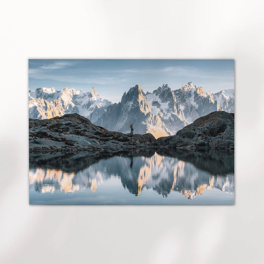
Landscape subjects with water tend to carry autumn tones particularly well. A still lake reflection doubles the warm colour in the image and gives it a calm, horizontal quality that works in most rooms. The Eibsee in Autumn print is a good example — the larch reflections in the foreground and the Zugspitze rising behind create strong vertical and horizontal structure, so the image holds on the wall rather than drifting.
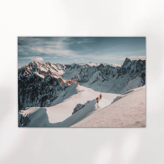
Wildlife prints are worth considering too, especially if you want something that doesn't read immediately as a landscape. A deer in a forest, particularly in misty or low-contrast conditions, brings warmth and texture without competing with other art in the room. It also appeals to people who aren't drawn to pure landscapes, which matters if you're choosing something for a shared space or buying as a gift. The wildlife photography prints in the full collection sit in that space between nature and portrait — they have a subject to look at, not just a scene.
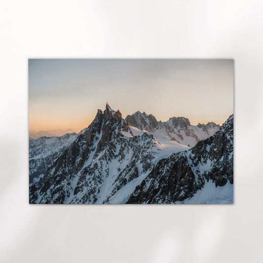
Mountain prints with clear pastel skies, like the Alpspitze at dusk, are a slightly different proposition. The sky pulls cool and the rock is warm, so you get contrast within the image itself. These tend to work well in rooms where everything else is neutral — they add warmth without committing fully to it, which is useful if you're not sure how far you want to go.


Which Rooms Suit Warm Landscape Prints
Living rooms are the obvious answer, but the specifics matter. A large warm landscape works above a sofa when the sofa is a neutral — grey, oatmeal, dark navy. Put it above a terracotta sofa or warm brown leather and you need to think harder about whether you're adding warmth or just amplifying something that's already dominant. In that case, a print with cool elements — a pale sky, snow on the peaks, still grey-blue water — tends to balance the room better than doubling down on warm tones.
Hallways and entryways are underrated for this kind of print. They're often north-facing, slightly dark, and the first thing you see when you come in. A warm landscape in that spot — particularly one with a sense of space and light in it — changes how the whole house feels from the door. The Ammersee boathouse print works well here. The golden hour light on the water and the soft starburst reflection have enough luminosity to lift a dark hallway without needing to be a large format print to do it.
For home offices, warm tones are a different decision. A busy or highly detailed landscape can be distracting when you're working. The prints that tend to work best in office spaces are ones with a clear horizon and open space — water, sky, distance. Something the eye can settle on and then come back from. The post on home office wall art goes further on this if you're decorating a workspace specifically.


Ammersee, Bavaria, Germany
Shot at golden hour on the Ammersee, one of the lakes south of Munich that most visitors never get to. The boathouse, the bare trees, the starburst reflection on the water — it has the stillness of a place winding down for winter. Works particularly well in hallways and rooms that need light rather than drama.
View Print →


Warm tones, real places, printed to last.
Every print in the collection is shot on location and printed on museum-quality matte paper. Available in multiple sizes, printed and shipped to your door.
Browse Prints →