Black and White Mountain Painting: A Complete Guide
How to choose, style and hang monochrome mountain art that actually does something on your wall.
Shop Now →A black and white mountain painting, whether painted or photographic, works because it removes everything except the thing you came for. No colour, no distraction, just the shape of the ridge and the quality of the light. If you're drawn to that kind of image, this guide covers what makes one work, how to choose the right format for your space, and what to look for before you buy. We've also pulled together some of the best monochrome mountain prints from the French Alps to give you something concrete to work with.
What Makes a Black and White Mountain Print Work
The best monochrome mountain images share one thing: they were taken or made at the right moment. Not the most dramatic moment, necessarily, but the one where the light was doing something specific. A low sun catching a ridge line. Cloud swallowing the upper third of a summit. Fresh snow flattening the mid-tones until the peak floats clean against a pale sky. Without colour, those tonal relationships become everything.
This is why black and white mountain photography is often more demanding than colour work. In a colour image, a saturated sky or warm rock can carry a picture even when the light is flat. Strip that away and you're left with contrast, composition and patience. The shots that work tend to come from people who know the mountain well, who understand what conditions to wait for and where to stand.
From a décor perspective, the absence of colour is also what makes these prints so versatile. A strong monochrome image brings visual weight and atmosphere to a room without fighting with existing colours. It can anchor a minimalist space or hold its own on a busier gallery wall. That's a harder balance to strike with a colour landscape, which needs the surrounding palette to cooperate.
If you're drawn to the idea but unsure where to start, it's worth reading about why black and white mountain wall art works in any home before going further. The short version: tonal contrast is timeless, and the right print will look as good in ten years as it does now.
Scale matters too. A small monochrome print can feel a little lost on a large wall. The format, whether portrait, landscape or square, should suit the shape of the space. More on that below.

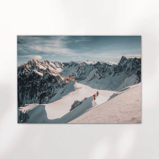
Aiguille de Bionnassay – Chamonix, France
A portrait-format shot of one of the sharpest ridges in the Mont Blanc massif. The tonal range here is narrow but precise, which is exactly what gives it presence on a wall. Works well solo or as part of a pair.
View Print →
Photography vs Traditional Painting: Which Should You Choose
When most people search for a black and white mountain painting, they have a broad idea in mind, something monochrome, something of mountains, something that feels like more than a snapshot. What they're often less certain about is whether they want a traditional painted work, a digital illustration, or a fine art photograph printed at high quality. Each has real merit, and the right choice depends on what you want the piece to do.
Traditional oil or watercolour paintings carry texture and the visible presence of a hand. They tend to cost more, and originals especially can be hard to live with at scale in a domestic setting. They're personal objects, which is part of the appeal. If you want something one-of-a-kind, that's the right direction.
"Strip away the colour and you're left with the essentials. Contrast, form, and the quality of the light."
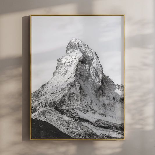
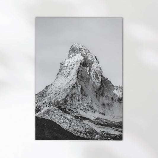
Fine art photography occupies a different space. A well-printed giclée photograph of a mountain can carry the same atmosphere as a painting, often more precisely, because the light is real. The tonal range of a properly processed black and white RAW file, printed on 200gsm matte stock, is something that needs to be seen in person to fully appreciate. It's not a poster. It's closer to a silver gelatin darkroom print in terms of depth and detail.
For most people buying wall art for a home, fine art photography offers the best combination of quality, accessibility and emotional connection, especially if the image is of somewhere they know. The location matters. A photograph of a specific mountain at a specific moment carries a different weight than a stylised illustration of a generic peak.


Choosing the Right Format for Your Space
Format is one of the most practical decisions you'll make when buying a mountain print, and it's one most people get wrong by defaulting to a single landscape image when the wall would actually suit something different. Here's how to think about it.
Portrait prints suit tall, narrow walls, the space beside a door frame, the gap between windows, or anywhere a landscape format would feel too wide. For mountain photography, portrait framing works well when the subject is a vertical peak, a ridge with a strong vertical line, or a composition where sky and foreground have equal weight. The Aiguille de Bionnassay shot is a good example, that narrow spine of rock reads better in portrait than it would stretched across a landscape frame.
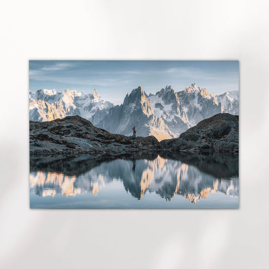
Landscape-oriented images suit wide, low walls, above sofas and beds, in hallways, and in rooms where you want the horizon to ground the space. A broad view across the Mont Blanc massif, shot from a high vantage point, sits differently to a portrait peak. It invites you into the scene rather than presenting you with it.
Pairs and triptychs are worth serious consideration if you have a larger wall. Two prints hung at the same height with a consistent gap create a visual narrative, especially if the images share a location or tonal style. The Bionnassay and Grandes Jorasses set works exactly like this: two peaks from the same massif, same treatment, same light quality, different forms. You get the variety of two distinct mountains without the disconnect that can come from pairing unrelated images. For the Aiguille du Midi, the triptych format spreads the ridge across three panels, which gives a wide wall something to breathe into.
Size is the other variable. As a rough guide, a single print above a sofa should be around two thirds the width of the sofa. For a feature wall, go larger than feels comfortable, larger prints tend to feel better in person than on screen. Most prints are available from A4 to A0, so there's room to scale up without any loss of quality on a well-shot giclée.


Aiguille de Bionnassay & Grandes Jorasses – Set of 2
Two black and white prints from the Chamonix valley, designed to hang together. The pair shares the same tonal approach and scale, so they sit comfortably side by side without competing. A good option if you want to fill a wider wall without breaking the visual logic.
View Print →Hanging and Styling Your Mountain Print
Once you have the print, the framing and hanging decisions matter almost as much as the image itself. A few things to get right.
For monochrome prints, a simple frame almost always works better than something ornate. Black, white or natural wood in a thin to medium profile keeps the focus on the image. Wide frames can overpower the print, especially at smaller sizes. If you're going frameless, a deep-set float mount can work well for a more contemporary feel.
Glass choice matters more than most people realise. Standard glass picks up reflections, especially in rooms with windows opposite. Anti-reflective or museum glass eliminates most of that, and on a black and white print, where the mid-tones are already subtle, you want to see everything the paper is doing rather than your own reflection. It costs more but it's worth it.
In terms of placement, black and white mountain prints tend to work in rooms where you want a point of stillness. Living rooms, bedrooms, home offices. They're less commonly found in kitchens and bathrooms, though there's no reason they shouldn't be. What they don't suit is a wall that's already very busy, either with pattern or with lots of other art. Give the print some breathing room and it will do its job. If you're thinking about a gift, it's worth reading about fine art prints for mountain lovers for some useful framing advice alongside the product ideas.
For people renovating or moving into a new home, a single strong black and white print can set the tone for a whole room before you've made any other decisions. It's easier to build a palette and a furniture scheme around a monochrome anchor than the other way around. The image gives you the mood. Everything else follows.
Single Statement Print
One large portrait or landscape print, hung at eye level, given room to breathe. Best for minimalist rooms, feature walls, or smaller spaces where a group of prints would feel crowded. Scale up further than feels comfortable on screen. It nearly always looks better in person.
Matched Pair
Two prints from the same location or with the same tonal treatment, hung at the same height with a consistent gap between them. Works well above a sofa or a wide console. Avoids the mismatch that can happen when pairing unrelated images. The Bionnassay and Jorasses set is built for exactly this.
Triptych
Three panels across a wide wall. The Aiguille du Midi triptych spreads a single ridge line across three frames, giving a large wall something substantial without the visual noise of a gallery arrangement. Works well above a bed, a long sideboard or a wide hallway wall.


Find Your Mountain Print
Every image in the collection was taken on location. Real mountains, real light, real effort to get there. Browse the full range and find something worth putting on your wall.
Browse Prints →