What Is a Giclée Print? Why It Matters for Fine Art Photography
The honest explanation of what the word actually means, and why it makes a difference to what ends up on your wall.
Shop Now →A giclée print is a high-resolution inkjet print made with pigment-based inks on archival paper. That's it. The word gets used a lot in fine art printing, sometimes to justify a higher price without much explanation, but the thing it refers to is real and it genuinely matters. The mistake most people make is buying a print that looks right in the shop photo and fades or shifts colour within a few years. That's almost always a dye-based inkjet, not a giclée. You can see what that looks like in practice with something like the Eibsee in Autumn print, where the colour in those larch trees and that turquoise water only works if the printing is accurate.
What giclée actually means
The process uses a wide-format inkjet printer loaded with pigment-based inks, printing at very high resolution onto archival paper. The resolution matters because photographic detail, particularly in landscape work, requires fine gradations of tone. A mountain reflected in still water, or the texture of rock in raking light, breaks down quickly if the output resolution is low. Giclée printing typically operates at 1440 dpi or above, which is why fine detail holds at larger sizes.
The paper matters as much as the ink. Archival papers are acid-free and designed to resist yellowing over time. Most fine art giclée printing uses papers rated for significant longevity, which is tested independently through light-fastness standards. The 200gsm matte paper we use is heavy enough that it doesn't curl at the edges when unrolled, which cheaper papers do. On the wall, the matte finish means the image is what you see, not a reflection of the window behind you.
None of this is new. Museums have used giclée for reproduction work for decades. The reason is simple: pigment inks don't shift colour under gallery lighting the way dye-based prints do. What's changed is that the same technology is now accessible for fine art photography prints at reasonable prices, rather than being limited to museum reproductions.
If you're looking at landscape photography for your home, the Switzerland wall art guide goes into the specific prints and locations worth considering, and the same quality standards apply across all of them.

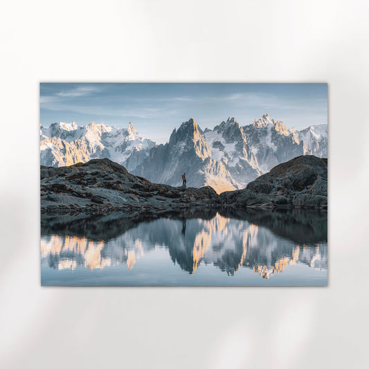
Eibsee in Autumn, Bavaria, Germany
Shot in October when the larches turn and the Zugspitze catches the first snow. The colour range in this image, from the gold of the trees to the deep turquoise of the lake, is exactly why archival pigment printing matters. On matte paper, the tones stay separate and clean.
View Print →
Pigment vs dye: why it matters
Most consumer inkjet printers use dye-based inks. They look vivid straight out of the printer. The problem is that dye inks work by soaking into the paper surface, and they're far more sensitive to UV light and humidity over time. Fading, colour shift, and loss of shadow detail are all common within ten to twenty-five years, sometimes sooner in bright rooms or near windows.
Pigment inks work differently. The pigment particles bond to the paper surface rather than absorbing into it. Because of that, they're far more stable under UV exposure and humidity fluctuation. Independent light-fastness testing, carried out under controlled conditions that simulate decades of display, consistently shows pigment-based giclée prints achieving archival ratings of 100 years or more under normal indoor display. That's not marketing language. It's the result of accelerated aging tests conducted by organisations like Wilhelm Imaging Research, which tests print longevity independently of manufacturers.
The practical implication is simple. A dye-based print might look fine when it arrives. In a well-lit room after ten years, it may not. A giclée print on archival paper with pigment inks is made to hold. That matters less for something you'll swap out in a year. It matters a lot for a photograph you actually care about.
The prints in the full collection are all produced this way. Same process, same paper, same pigment inks across every image. When customers send photos of prints still looking right five or six years after buying them, that's why. The bedroom wall art guide also touches on placement and light considerations worth knowing if you're choosing a spot for a print.


What to look for when buying
Not everything sold as a giclée print is equal. The word itself isn't regulated, which means any inkjet print can technically be called one. What you want to know is whether pigment inks were used, what the paper specification is, and whether there's an archival rating attached. A printer who can't tell you those things probably can't guarantee the longevity either.
Paper weight and surface finish affect the final look significantly. Heavier paper, from around 200gsm upward, holds detail better and feels more substantial when framed. Matte surfaces work well for landscape and nature photography because there's no glare to fight with. Glossy and semi-gloss papers can look sharp on screen but introduce reflections in certain lighting conditions that make images harder to read on a wall. For the kind of mountain and coastal work in this collection, matte is the right call almost every time.
Colour accuracy is the other thing worth asking about. A giclée print should be colour-managed throughout the process, from the original image file to the final output. That means printer profiles matched to specific papers, and regular calibration. When the Eibsee autumn shot comes back from printing and the water colour is exactly what was in the file, that's colour management working. When it comes back slightly cyan or with clipped highlights in the snow, something in the chain wasn't calibrated. You usually can't tell this from a product listing, but you can tell from the print once it arrives.


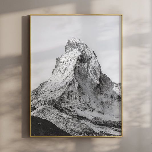
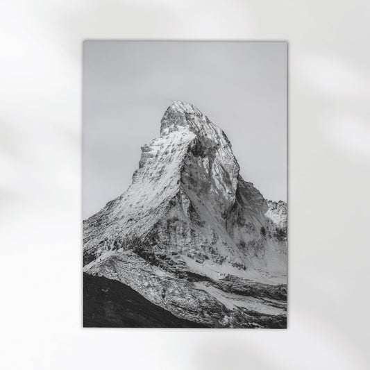
Aiguille d'Entrèves, Chamonix, France
The Aiguille d'Entrèves sits on the ridge between France and Italy, above the Géant Glacier. On a clear day, the light on that face is hard and bright with almost no mid-tones. Holding that contrast range accurately on paper is exactly the kind of thing that separates a giclée print from a standard inkjet output.
View Print →"A print you buy today should still look right in thirty years. That's not a selling point — it's just what archival printing is supposed to do."


Most people don't think about how a print is made until they notice one fading above a sofa three years after buying it. Giclée isn't a premium tier invented to justify a price difference. It's just the right way to make something that's meant to last. The photographs here were made in places worth remembering. It's worth printing them properly.
Mark, Chamonix Prints
Browse the Full Collection
Every print is produced as a giclée print on archival matte paper, made to order and shipped to your door. Mountains, coastlines, lakes. Places worth keeping on a wall.
Browse Prints →