Kitchen Wall Art: What Works in the Most Underrated Room in the House
Most rooms get the careful treatment. The kitchen gets a chalkboard sign or nothing at all.
Shop Prints →Kitchen wall art gets less thought than it deserves. It's the room most people spend the most time in, and somehow it ends up with a novelty print about wine or a blank wall where something interesting could go. The problem isn't a lack of options. It's that kitchens have more visual noise than any other room in the house, and most people don't think about that when they're choosing what to hang. Appliances, cabinet fronts, tile grout lines, worktop edges — the room is already asking a lot of the eye. A print that would look calm in a hallway can look chaotic in a kitchen. The rules here are different, and they're worth understanding before you buy anything.
Why Kitchens Are Harder Than You Think
Walk into your kitchen and look at one wall. Count the horizontal lines — the worktop edge, the underside of the cabinets, the top of the splashback, the bottom of the units above. Then count the vertical ones. Before you've put anything on the wall, there's already a grid of competing lines pulling the eye in different directions. A print doesn't land in that room the same way it lands above a sofa.
This is why the usual advice about kitchen wall art gets it wrong. Recommending a food print or a botanical illustration because it fits the kitchen is lazy advice, and it usually results in something that looks like it came with the house. The subject matter is almost irrelevant. What matters is whether the composition can hold its own in a room that's already visually busy. A detailed, fussy print just adds to the noise. Something with open sky, clean space, or a single point of focus does the opposite.
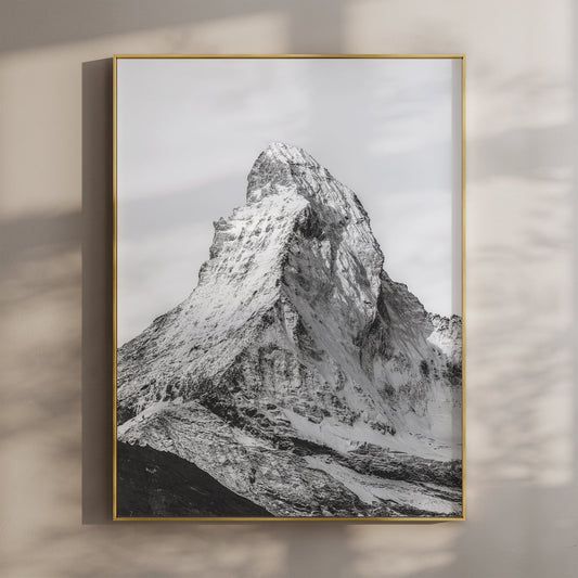
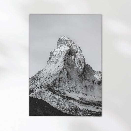
Black and white prints are worth considering here for practical reasons, not just aesthetic ones. They don't compete with the colour in the room — the timber of cabinets, the tone of the tiles, whatever's sitting on the worktop. A monochrome mountain or coastal print sits quietly in a way that a colour image usually can't manage in that environment. That said, if your kitchen is predominantly neutral — white cabinets, pale stone — a colour landscape with a lot of sky can work well. It depends on what you're working with. There's no universal answer, but black and white is the more forgiving starting point. You can see how that plays out in prints like the Aiguille de Bionnassay in black and white, where the contrast is strong enough to read clearly without overwhelming a busy wall.
The other thing most kitchen wall art advice skips: where exactly you're hanging it. Kitchens rarely have large, uninterrupted wall space. There's usually a run of cabinets, a window, a door, a fridge. The wall you have to work with is often smaller than you think, and the placement matters more than the print itself if you get it wrong.

Aescher Guesthouse – Appenzell, Switzerland
A rare shot — the Berggasthaus Aescher tucked into its cliff above the Appenzell valleys, with enough sky and open landscape to give the composition real breathing room. Works in a kitchen because it doesn't fight. One clear subject, clean tones, space around it.
View Product →
What Actually Works as Kitchen Wall Art
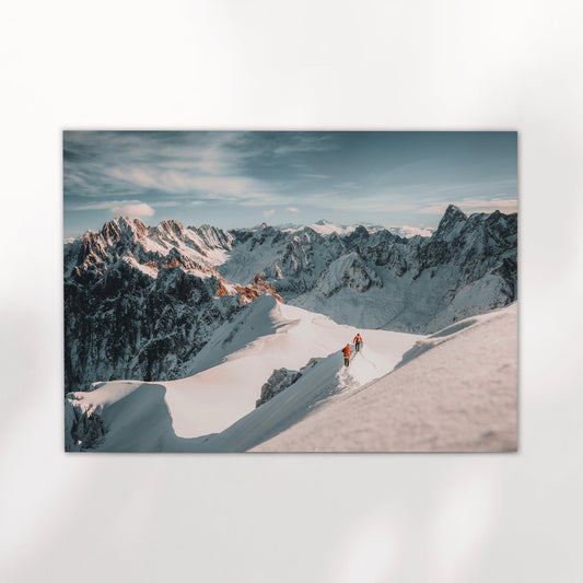
The prints that work in kitchens are the ones with room in them. Not room as in physical size — room as in compositional space. A mountain with a lot of open sky above it. A landscape where the eye can settle somewhere without being sent immediately somewhere else. The kitchen gives the print nowhere to breathe if the print doesn't already have breathing built into it.
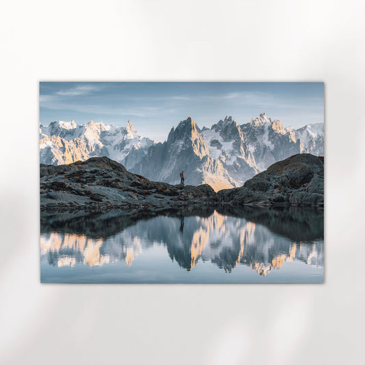
Landscapes work here for the same reason they work in home offices and bathrooms — they're visually quiet when they need to be. A mountain photograph with strong negative space around the peak does something useful in a kitchen: it slows the room down slightly. Not in a decorative, aspirational sense. Just practically. There's one thing to look at, and it's calm. That matters more in a kitchen than in almost any other room, because kitchens tend to be active, high-traffic spaces where the last thing you need is more visual complexity on the walls.
Pairs of prints can work well here too, especially in a kitchen with a longer blank wall. Two black and white mountain prints at a consistent size read as a considered choice rather than a space-filler. You can see how that looks with the Bionnassay and Grandes Jorasses set — two portraits that balance each other without needing to match exactly. If you're interested in how Switzerland landscapes translate to print more broadly, the Switzerland wall art guide covers the full range.


Size and Placement in a Tighter Space
Kitchen walls are rarely straightforward. They're interrupted by cabinets, windows, extractor hoods, doors. The usable wall space is usually smaller than it looks, and it's worth measuring before you commit to a size. In most kitchens, a 30x40cm or 40x50cm print is close to the practical ceiling. Larger than that and you're often fighting with something else in the room for dominance — and the print usually loses.
Portrait orientation tends to work better than landscape in kitchens, for a simple reason. Kitchen walls tend to be taller than they are wide, because cabinets eat into the horizontal space. A tall, narrow print can occupy a slim but clear stretch of wall where a wide horizontal one would feel cramped or need to be scaled down to fit. This is worth thinking about before you default to a landscape-format print just because most photography is shot that way. The portrait version of the Aiguille d'Entrèves is a good example of a composition that was framed with exactly this kind of narrow wall in mind.
One honest note: if the only wall you have is the space above the hob or very close to the sink, a print probably isn't the right choice. Steam and moisture will affect it over time regardless of print quality. The room matters as much as the art. If the wall is clean and clear, a good landscape print can sit there for years without any issue. Browse the full collection if you're still working out what fits the space — there's a lot of variation in tone and composition, and it's worth seeing the range before you decide.


Aiguille de Bionnassay – Chamonix, France (Black & White)
One of the sharper peaks in the Mont Blanc massif, shot in monochrome. The tonal range is wide enough that the print reads clearly at smaller sizes — which matters in a kitchen where you're rarely working with a large wall. A reliable choice for a room that punishes busy compositions.
View Product →


The kitchen is worth the same attention as any other room. It just needs a slightly different approach — simpler compositions, realistic sizing, and a print that knows how to sit quietly in a busy space.
Mark Fitzsimons, Chamonix Prints
Find the Right Print for Your Kitchen
Mountain and landscape photography, shot on location. Delivered in 5–7 business days.
Browse the Collection →